Grounded. Expressive. Timeless.
Autumn/Winter 2027 brings a noticeable shift in the way colour is used in the home.
After seasons dominated by quiet neutrals, AW27 does not abandon calm interiors — instead, it adds emotion, depth and personality.
Consumers are looking for homes that feel protective and comfortable, but also individual. This creates an exciting balance between earthy natural colours, deep sophisticated shades, restorative greens, mineral blues and warm layered neutrals.
For home décor buyers, the opportunity is not simply to follow one fashionable colour. The strongest AW27 collections will combine commercial core colours with carefully selected fashion accents.
Here are five key colour stories we believe offer particularly strong potential for AW27 home décor.
01 — EARTH & EMBER
Warm • Organic • Grounded
The first major direction takes inspiration from clay, autumn leaves, bark and sun-baked earth.
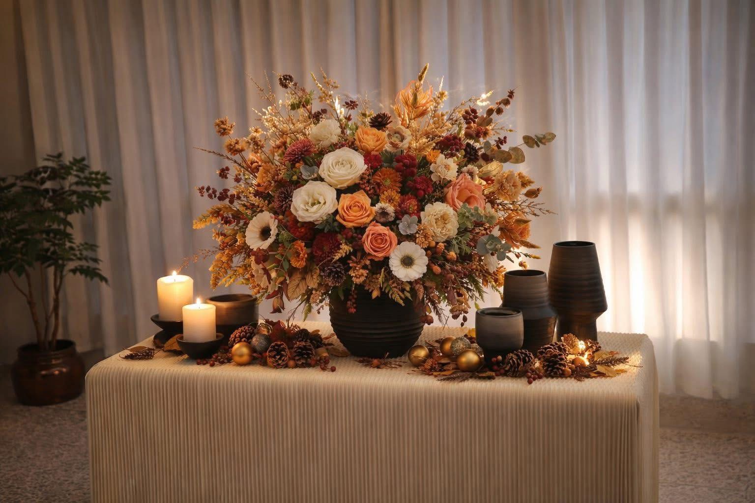
Terracotta evolves into richer shades of russet, cinnamon, caramel and burnt sienna, creating interiors that feel warm without becoming overly rustic.
These colours are especially effective on ceramics because reactive and matte glazes give them additional depth.
Key Colours
Russet • Adobe • Cinnamon • Caramel • Burnt Clay • Bark • Warm Cream
Best Products
Ceramic vases • Flower pots • Candleholders • Bowls • Decorative objects • Textured cushions
Materials & Finishes
Reactive glaze • Matte ceramic • Rough stoneware • Wood • Bouclé • Brushed metal
Floral Pairing
Autumn foliage, burgundy hydrangea, burnt-orange dahlia, berries and sculptural branches.
Commercial potential: VERY HIGH
⸻
02 — PLUM NOIR
Deep • Dramatic • Luxurious
AW27 introduces a darker romantic direction.
Deep plum, berry, aubergine and wine tones create an intimate atmosphere and provide an elegant alternative to black.
The important change is that these colours should not feel heavy or traditional.
Pairing them with smoky glass, dusty lilac, warm cream and small metallic details gives the palette a much more contemporary appearance.
Key Colours
Deep Plum • Mulberry • Aubergine • Wine • Blackberry • Dusty Lilac • Smoky Grey
Best Products
Coloured glass • Vases • Candleholders • Decorative bowls • Velvet accessories • Artificial flowers
Floral Pairing
Dark hydrangea, burgundy dahlia, helleborus, plum rose and berry branches.
Commercial potential: HIGH
⸻
03 — FOREST SANCTUARY
Natural • Calming • Restorative
Green becomes deeper for AW27.
Instead of bright botanical greens, expect forest, moss, olive and lichen.
These shades reflect the growing desire to create interiors that feel restorative and connected with nature.
Deep Green is especially important because it can function almost like a softer alternative to black.
Key Colours
Forest • Deep Green • Moss • Olive • Lichen • Sage • Stone
Best Products
Ceramic pots • Vases • Planters • Artificial plants • Candleholders • Textiles
Materials
Reactive ceramic • Moss-like textures • Natural stone • Wood • Aged metal • Heavy linen
Floral Pairing
Eucalyptus, olive branches, ferns, green hydrangea, helleborus and berries.
This is particularly suitable for coordinated ceramic + artificial botanical collections.
Commercial potential: VERY HIGH
⸻
04 — MINERAL BLUE
Cool • Serene • Contemporary
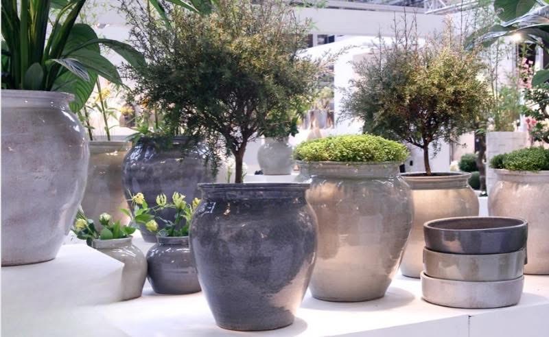
Blue remains important, but AW27 gives it more complexity.
The direction ranges from misty grey-blue and mineral tones through to much stronger saturated blue accents.
WGSN/Coloro’s Luminous Blue direction reinforces blue’s importance around 2027, but for commercial home décor we recommend using the strongest blues selectively.
Key Colours
Mineral Blue • Slate Blue • Storm Blue • Blue Fog • Grey Blue • Luminous Blue Accent
Best Products
Vases • Glassware • Decorative ceramics • Tabletop • Cushions • Artificial flowers
Commercial Colour Formula
70% mineral/muted blue
20% neutral
10% strong blue accent
This keeps the collection sophisticated while still providing visual impact for displays.
Floral Pairing
Blue hydrangea, delphinium, thistle, eucalyptus and soft cream flowers.
Commercial potential: HIGH
⸻
05 — WARM NEUTRALS
Timeless • Soft • Versatile
Neutral interiors are not disappearing.
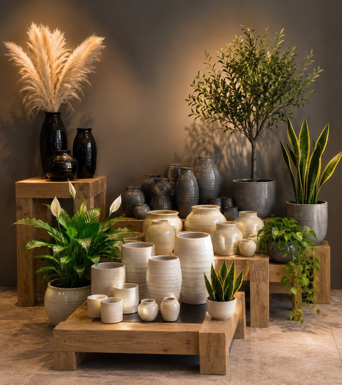
Instead, cool grey continues to give way to warmer, more tactile neutrals.
Think oat, sand, mushroom, almond, camel and warm stone.
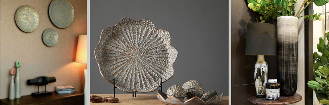
Rather than relying on colour alone, this direction depends heavily on surface and texture.
A cream vase becomes more interesting through ribbing, reactive glaze, sculptural form or handcrafted irregularity.
Key Colours
Oat • Sand • Almond • Mushroom • Camel • Warm Stone • Soft Ivory
Best Products
Vases • Pots • Sculptural objects • Lamps • Candleholders • Textiles
Materials & Finishes
Matte ceramics • Reactive glaze • Travertine effects • Ribbing • Linen • Bouclé • Wood
Floral Pairing
Cream hydrangea, white blossom, beige grasses, soft peach flowers and natural branches.
Commercial potential: EXTREMELY HIGH
⸻
THE AW27 COLOUR FORMULA
For a commercially balanced European home décor assortment, we recommend approximately:
35% — Warm Neutrals
Sand, cream, mushroom, camel and stone.
25% — Natural Greens
Forest, moss, olive and sage.
20% — Earth & Ember
Russet, terracotta, cinnamon and caramel.
10% — Mineral Blues
Muted blue, slate and stronger blue accents.
10% — Plum & Fashion Colours
Plum, berry, lilac and selected seasonal accents.
This approach creates a collection that feels new without making the entire assortment overly trend-driven.
COLOUR + TEXTURE = THE NEW LUXURY
For AW27, colour alone is not enough.
The same colour can look completely different depending on its surface.
A forest-green vase in high gloss feels luxurious.
The same green in a rough reactive glaze feels natural and handcrafted.
A cream vase with a perfectly smooth finish feels minimal.
Add irregular ribbing and it becomes artisanal.
Therefore, AW27 product development should increasingly consider:
COLOUR + MATERIAL + TEXTURE + SHAPE
as one complete design decision.
THE BIG COMMERCIAL OPPORTUNITY
For retailers, the strongest collections will allow products to work together across categories.
Instead of developing ceramics, artificial flowers and accessories independently, build complete colour stories.
For example:
Forest Sanctuary
Deep green ceramic vase
* eucalyptus stems
* moss-green candleholder
* cream decorative object
* textured cushion.
Or:
Earth & Ember
Russet vase
* autumn branch
* amber glass candleholder
* caramel pot
* warm neutral textile.
This makes visual merchandising easier and encourages customers to purchase multiple coordinating products.
AW27 — THE KEY MESSAGE
AW27 home décor is moving toward interiors that feel:
Warmer. Deeper. More natural. More emotional.
Earth tones create security.
Deep plum brings sophistication.
Forest greens reconnect us with nature.
Mineral blues introduce calm and modernity.
Warm neutrals provide the commercial foundation.
The opportunity for AW27 is therefore not to choose between trend and timelessness.
It is to combine them.
Grounded colours. Expressive accents. Natural materials. Timeless homes.


